|
CASE STUDY
Nike.com - Pure Play
How the international sports retailer uses a successful graphic
design strategy for branding across an online network.
by Shayne Bowman and Chris Willis
March, 2002
Challenge
Target different online audiences around the world, with different
products, while maintaining core brand identity in a network of
sites. Extend the brand experience from a 30 second TV-spot to something
that's much deeper.
Strength
Nike has a tradition of strong graphic identity, enormous brand
awareness. They are the undisputed heavyweight champion of branding.
In 2000, they sold nearly $9 billion sneakers, sweats, golf balls
and more around the globe. Yet, they admit they're not in the apparel
business. They're in the image business. From Tiger Woods to Michael
Jordan, Nike surrounds itself with winners. Their print and TV ads
are legendary for their sophistication, wit and execution. In a
sense they strive for something close to perfection in crafting
a message that's irresistible.
A network of targeted micro sites
Unlike its rival companies, Nike presents itself to many different
audiences in different ways. It's a marketing strategy born from
a sophisticated understanding of how people respond to images of
lifestyle. Whereas most companies develop products for an existing
market, Nike tries equally to create the image first and then respond
to the market that emerges.
But devising a tactic to pursue niche markets is something not
solved with a one-size-fits-all design approach. If your business
is going after myriad audiences, it would be nearly impossible to
satisfy the needs of all customers under one umbrella mega-site.
The web is not a mass marketing engine. It's a place to begin one-to-one
conversations with your customers. Male street basketball players
are not likely to identify with the same site content as a female
tennis players. Each Nike product has a particular group of potential
athletes in mind. Each Nike site goes after those target groups,
first beginning with the country, then the sport, i.e. NikeGolf.com,
then with marketing content and products. Using similar structure,
color, grid and logo treatment, Nike has created a cohesive identity
across the network, but with relevant individuality to the target
audience.
:: Chart of
the Nike network
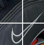
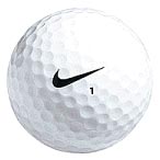
The Swoosh remains the same
Though it is only about 30 years old, there are few other symbols
more recognizable around the world than the Nike Swoosh. Its form
is simple and swift. It's meaning built masterfully over the years
with billions of dollars of products, advertisements and research.
Like a famous signature, it has earned a unique right to identify
something as special — whether it's a pair of running shorts
or a golf ball.
For such an elegant shape, the Swoosh carries a lot of weight.
It is not a logo that is dressed up in lot of colors, showing up
mostly in black or white. Nor does the logo change often, unlike
the stylistically-driven Alfred A. Knopf dog. That it's strength.
Keeping the Nike Swoosh conservative and consistent allows it to
become a unifying device across channels such as TV, print or Web,
which tend to be anything but that.
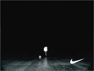
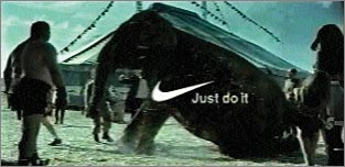
Such an approach gives the logo a status nearly approaching reverence
but with versatility. This has been used to great effect in many
Nike TV spots. The Swoosh can be at once seen as a symbol of ultra-cool
punctuating the end of a basketball
ad. Or it can be seen as deadpan funny when it appears like
a punch line after Lance Armstrong
has resuscitated a fallen elephant.
Such a pure example of iconography is rare and must be treated
with respect. On the Web, Nike uses it's logo small and usually
in the upper-left or lower right corner of their pages — quiet
but confident. But the Swoosh is about the only thing stays constant.
It's not unusual for Nike to completely gut its NikeTown stores
for a new look every 18 months. If their stores are that malleable,
imagine the amount of change to their sites. Regardless of this
constant change, the Swoosh will always remain the same.
A consistent structure
To embark on a strategy of creating as many sub-sites as Nike does
requires more than a great logo to succeed. It requires a strong
graphic identity and skill. Nike is adept at not only sniffing out
popular cultural trends and desires but creating them as well. And
to engage it's multifaceted audience to its many lifestyle images
— such as "Ballers" or "Everyday Athletes"
— Nike has turned to the Web and begun to create fine-tuned
microsites.
The content on each site is unique and typically bathed in widly
diverse color schemes. To anchor the designs, Nike keeps most pages
neatly framed with gray bars holding similar elements like teasers
to new sneakers or contests. Such structural cues can also provide
an easy out for the confused or disinterested user.
Pages are designed with a modular approach in mind allowing elements
to be mixed and matched. A repeated modular structure is valuable
because it can be learned.
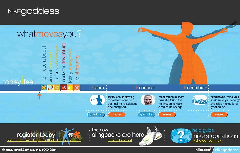
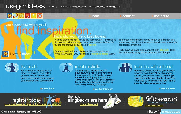
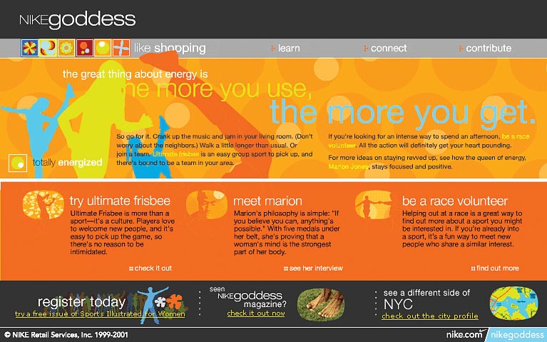
For example, the Nike Goddess
site lets visitors to explore based on their mood rather than sport.
It might sound like a confusing way to navigate but each mood is
made up of the same modular parts — learn something, meet someone,
do something.
Notice the differences between the "boost"
and "energized" pages
of NikeGoddess.com. The background colors are complimentary and
the content is differerent but modular structure keeps them coherent
and familiar enough to make it easy to find what interests you.
Scale, proportion and the grid
Different Nike micro-sites share common proportions, repetitive
linear elements, and contrast. Pages are mostly devoid of sweeping
arcs that have become motifs on other sites. Starting with the global
homepage and beyond, there is an emphasis on the grid.
Notice how pages are typically horizontal, sometimes reaching the
16:9 proportions of widescreen movies. No scrolling down through
pages of text and links. If it can't fit on the grid in a the size
and scale necessary to fit in one screenful, it is made to do so.
The overall effect is one of coordinated rhythm.
:: Nike network
portal
:: Nike Basketball freestyle
remixer
:: Nike Europe portal
:: Nike Hockey equipment
page
If you push the envelope, provide alternatives
Nike is performance minded. And wants to create as complete an experience
as possible whether in a NikeTown store or on the Web. There are
inherent dangers to attempting immersive experiences. The greatest
of these is confusion. Many Flash sites are confusing because they
are unable to match up a worthwhile experience with what the technology
can deliver.
Nike does a smart thing and embraces the limitations of technology.
This must be difficult for such a perfomance-minded company used
to pushing the envelope. But holding back, while requiring great
discipline, is worth it.
On the Goddess site there are numerous simple Flash animations
that explain something without crashing your browser or clogging
a 56K modem. For more complicated experiences like the Freestyle
mix, clearly labled plugins are noted and different length downloads
are given as options.
Does this mean you should abandon experimentation? No. But you
should make clear expectations to your users and do so in a non-exclusionary
way. Remember you are not just designing a site but an experience.
And if that experience is one of frustration or anxiety, you have
failed.
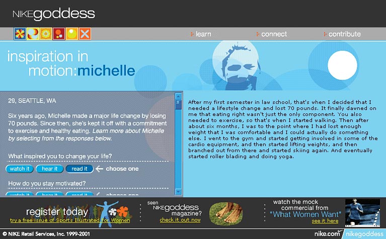
A simple solution is to always offer alternatives to getting information.
Nike provides not only video and audio but also transcripts of all
the women interviewed on the Goddess
site.
When thinking of pushing the envelope, ask yourself two questions:
• Is my design addressing the immediate needs of the site?
• Will the design and interaction experience enhance the reputation
and image of the company?
Make the visitor the hero
Nike's site offers us an interesting idea when it comes to designing
an online identity — make the site visitor the hero. Don't
just shower them with unearned praise, challenge them to learn,
provide them with the tools and information to decide and act for
themselves.
This can be as simple as adding some customizable elements or more
challenging such as letting them re-edit a famous commercial. Allow
users to reveal what's important to them and why. The act of opening
a dialogue is sometimes reward enough.
:: Nike ID products
:: Nike ACD Crash - snowboarding
Nike takes our ideas of beauty, grace, speed or sex and tells them
back to us in their own way. But if Nike were to simply plaster
these symbols on a web page, they would remain merely abstractions
and pretty boring.
Nike's real design skill is making these ideas represent some greater
concept, which is powered by the emotional and intellectual stock
we're willing to bring to it. How do they do that? By using design,
symbolism and coherence to stir up the most seductive idea to date
— that there's a hero within you.
Shayne
Bowman and Chris Willis
of Hypergene.net, specialize in media product development and presentation
design. They write and speak frequently on information & graphic
design, creative development and the design process.
* "Nike" and the Nike logo are registered trademarks of Nike.
|